For this Design Blitz assignment, I photographed four examples of design concepts that appear in everyday life. Before completing this project, I did not realize how many design choices influence the way people interact with products, buildings, and advertisements. Looking closely at these examples helped me better understand how design communicates messages, attracts attention, and creates organization. The four concepts I focused on were minimalism and use of space, form and function, balance, and dominance.
#1 Minimalism & Use of Space – Taco Bell Baja Blast Cup

For my first photo, I photographed a Taco Bell Baja Blast cup. This example demonstrates minimalism because the design uses a limited color palette and focuses on a few key elements rather than overwhelming the viewer with information. The Baja Blast logo stands out clearly against the background, while the remaining space helps keep the design clean and easy to recognize. The cup does not need excessive graphics because the branding itself is already strong and recognizable. This example shows how simplicity can make a design more effective and memorable.
#2 Form, Function, and Message – Push Door
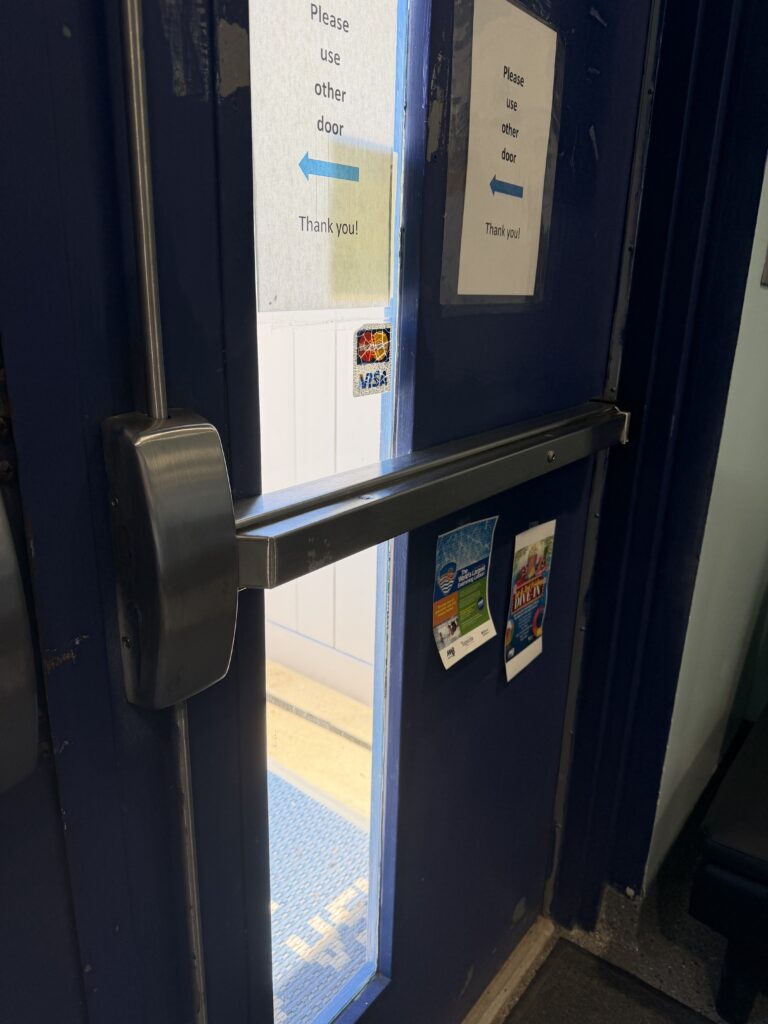
My second photo shows a push door with a horizontal push bar. This is a strong example of form and function because the design immediately communicates how the door should be used. Without reading instructions, most people understand that the bar is meant to be pushed. The design matches its purpose and reduces confusion for users. This example reminded me that good design should make everyday tasks feel natural and intuitive.
#3 Balance – Building Entrance
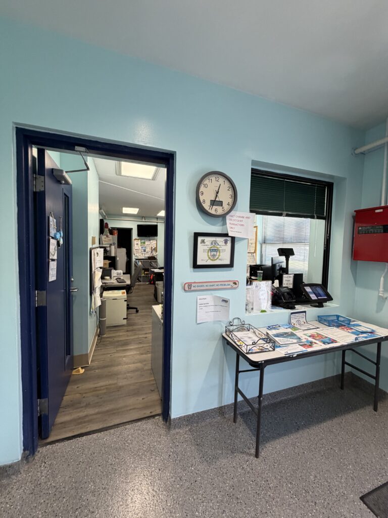
For my third photo, I photographed the entrance of a building with symmetrical windows and architectural features. This example demonstrates balance because the visual weight is evenly distributed across both sides of the structure. The symmetry creates a sense of order, stability, and professionalism. The balanced design makes the building appear organized and welcoming. This example helped me understand how balance influences the overall feeling of a space.
#4 Dominance – Movie Advertisement
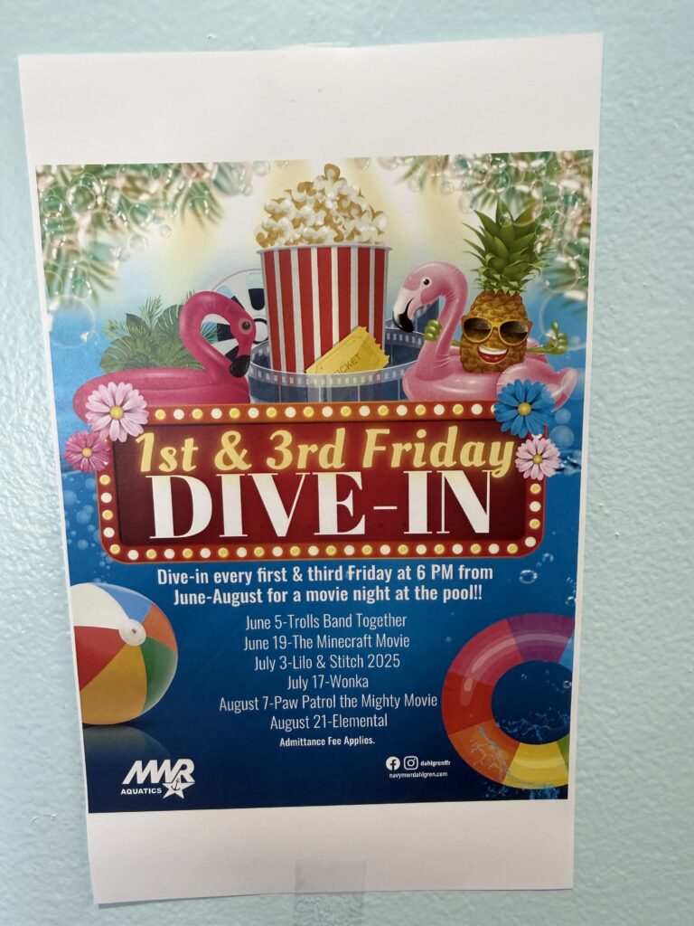
For my final photo, I photographed a movie advertisement featuring a poster with information. This image demonstrates dominance because one element immediately grabs attention before anything else. The bold text and large size of the message makes it the focal point of the design. My eye is drawn to that information first before noticing any smaller details. I also am drawn to the bold colors and design which stands out. This example shows how designers use size, placement, and contrast to direct viewers toward the most important message.
CONCLUSION
Overall, this assignment helped me become more aware of how design principles appear in everyday life. From a Baja Blast cup to a building entrance, each example demonstrated how designers use visual elements to communicate effectively. I learned that successful design is often simple, purposeful, and carefully organized to guide the viewer’s attention.
If you want to check out these photos and more of mine click here
Leave a Reply